Category Archives: Uncategorized

Mixed Media – Week One

Standard

Friday marked the beginning of a 6 week Mixed Media class at Toronto School of Art with Jacqueline Treloar.  Having failed Grade 9 Art, I feel there is nowhere to go but up.

I am a blank page

I am a blank page

I decided to work on what I consider one of the ugliest fabrics in my entire collection:

$$$$$$$$$$

$$$$$$$$$$

After a demo on acrylic paints & inks, squeegees and rollers, I set out to change this monetary monstrosity.  First I used a pinkish acrylic ink with a roller over part of it but this was barely noticeable.  I added some red and blue horizontal splotches with a squeegee.  Then, at Jacqueline’s suggestion, I lay down painter’s tape in vertical stripes across the piece and painted rough red lines off the tape.  I highlighted the straight side of the red stripe with very thin lines of  white acrylic and defined them even further with a blue pencil.   Class was over.

Not sure where this is going....

Not sure where this is going….

At home, I sandwiched it, picked out a variegated thread to match and did some straight line quilting to accent the vertical stripes even more.


the finish

the finish


Hanging in my kitchen now!  $$$$$$$$


Gitarzan

Standard

I am working on a special quilt for my brother who is a biker, retired police officer and guitar man.  This song title popped into my head for some reason and I played the YouTube video for some inspiration.  Note how it is spelled “Guitarzan” in the video description yet the CD/album cover clearly spells it “Gitarzan” … now I know “guitar” is spelled “guitar” and logically it follows that the song would be “Guitarzan” but it is curious now to me that I am arguing in point for the illogical yet chosen spelling (by the songwriter) when normally I would be arguing in favour of proper spelling…oooh the irony ….or is it the dichotomy – God, I love words.

Needless to say that the song was not that inspirational but I continued to quilt the piece anyway.

detail not too pretty close-up

not so pretty close-up – hope it gets better


What was I thinking?

Standard

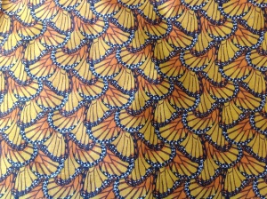
Several years ago I just had to have this fabric:

Butterfly Fabric

I bought a half yard of it for about $5,  thinking it would be useful somehow in one of my art quilts……
I have since learned that it is best to use fabric that does not look like the object you wish to represent – in other words: don’t use butterfly fabric when you want to create quilted butterflies.

I thought this fabric would be relegated to a shelf in my studio for a long time.

I was wrong…


Mooooo

Standard

I am not a big fan of applique but I got my hands on a Cow Picture Quilt kit by Malec Designs and thought I would give it a go – I might even grow to like applique, who knows?

The kit included a master drawing, instructions and freezer paper as well as 8 – 8 x 10 inch pieces of fabric.  Here is the selection of fabrics, all numbered on PostIt Notes and ready to be cut.

organization plus!

organization plus!

I think the hardest part so far has been deciding which fabric to use for the various parts of the cow’s face.

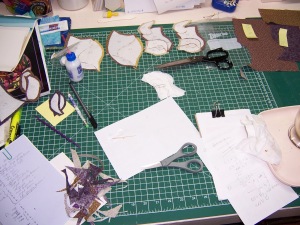
I had to trace and label all the pattern pieces onto the freezer paper and then cut them out and iron them to the right side of the fabric pieces.  Can anyone see where this might be a problem???  Don’t worry, I am very organized so all is good.

Here are some of the fabric pieces all covered up with freezer paper:

one big mess right now

one big mess right now

Then you start to glue all the pieces together with a washable glue.  Not hard to do but a little messy.  Good think I wasn’t wearing my good Onesie.  When you are done, you have something that looks like this:

ghost cow LOL

ghost cow LOL

I am really hoping at this point that I used the right fabric for each section.  Could be a very strange looking cow if I didn’t…

Stay tuned for the reveal!

Colour Theory – Part 2 – Who’s the Pushy One?

Standard

When you look at a quilt, what colour do you see first?  For example, in this little patchwork, which square do you notice first?

patchwork block

patchwork block

For me, it was the yellow and I’ve recently learned that is not surprising.  You can predict it as there is a such a thing as colour dominance and our friend yellow is the most dominant.  Warm colours, on the right side of the colour wheel (see Colour Theory – Part 1 post), are also kind of pushy.

But let’s talk about yellow for now:

It is considered a happy colour but too much of it can be disturbing.  Yellow is difficult for the human eye to process.   It will advance from its surroundings. Globally yellow denotes caution, as in amber traffic lights or yellow cards in soccer
(remind me to tell you of the time I got one).  Because of its high visibility, it is often used on school buses or police cars.  My first car was a yellow Mustang , TBar roof – everybody noticed it – I loved that car!  But I digress…back to quilting.

How to use yellow in your quilts?

Well, yellow is very effective on a black background:

shooting-star-quilt-block-1

but it tends to disappear on white.

$T2eC16JHJHoE9n3Kd66sBQW1fe1t8!~~60_35

It is great used as a “Zinger”:   a small amount in the right place can add punch, catch your eye and give your quilt a bouncy, energetic feel.

You should scatter it around your quilt – that is , unless you want to highlight a focal point.  If you do, a  single line of yellow will draw your eye right to it.

What about you?  How do you feel about the dominance of yellow?

Colour Theory – Part One

Standard

I don’t know about you but when I started quilting, I had very little confidence about my colour choices in quilting.  Kind of surprising since I have loved fashion all my life.  My favourite colour is turquoise and I gravitate towards it every time when looking at fabric.

Initially, I asked quilt shop staff to help me pick things out or I would rely on a prepackaged set of fat quarters. What I have learned over time is that there are no rules about combining colours but there are guidelines.  What has more impact is the value of the fabric, which will be the subject of another blog post in the future.

Over time, I began to develop my own sense of colour, sometimes relying on a focus fabric to help me, or instinct, and other times using a very helpful tool called the Colour Wheel.

This is what it looks like and you can find it on many sites online.

These are the 12 pure colours, of which there are 3 primary, 3 secondary and 6 tertiary.

The 3 primary colours – blue, red and yellow – are the basis for all other colours.  They are equidistant on the colour wheel.

The 3 secondary colours – green, orange & violet – are created when equal amounts of the primary colours are mixed together.  Blue + yellow = green;  yellow + red = orange; and blue + red = violet.

That leaves us with the 6 tertiary colours – yellow-green, yellow-orange, red-orange, red-violet, blue-violet and blue-green.  Their names come from the colours that sit on each side of them on the colour wheel.

If you add black to any of these colours, they get darker and are Shades of the original colour.

If you add grey to any colour, it becomes less intense and is called a Tone.

If white is added to a colour, it becomes lighter and is a Tint.

Shades, Tones and Tints will be the subject of a future post but the next one will be about Colour Dominance.

Be not afraid of colour.

Up From Here…..to there

Standard

Remember the original Up From Here block?  24 and a half inches square?  and I had 2 of them and just enough fabric left to fool around a bit with?

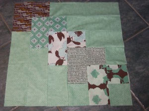
Here’s the original block:

100_1479

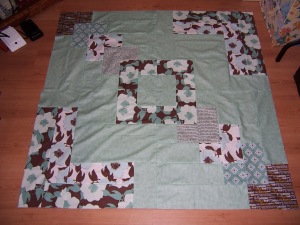
Here’s what I did with it:

100_3525

I think that will be it, though.  No borders – I think that would detract from the design.

Process Notes:

  • it was pretty easy to fool around with this block design – the measurements were already there for me and all I had to do was figure out how to apply them using the fabric I had left
  • I only had to pick out 3 small seams…
  • I love this fabric line! –  Paris & Company – glad I have about a fat quarter left of each fabric so I can make another project with them – or maybe I will piece them together somehow for the backing

If you like the block, here’s the link to the PDF file again:

(http://www.sewmamasew.com/march2013/MarchBOM2.pdf)

it’s all Up From Here…

Standard

This weekend I was inspired by a member of my Modern Quilt Guild:   Ann took one big block and surrounded it with a solid.  I thought it was very striking!  This is her block:

100_1469

The next day I happened to be doing a paper purge on my sewing desk and found a pattern from the Sew Mama Sew blog for a big (24.5 inches square!) modern block called Up From Here.  It was calling my name…..

Sew, following the instructions from the blog PDF file (http://www.sewmamasew.com/march2013/MarchBOM2.pdf),  I quickly whipped up 2 blocks.

100_1479

Not sure how I will finish the design yet as I did not have enough background fabric to make any more blocks but I do have enough to play around a bit.

Interesting note on the process:   it was recommended to press seams open, which I did and actually found a little awkward,  as I have been pressing all seams to one side for some time now…

Machine Sashiko – Can This Piece be Saved?

Standard

ASA210

         The art that is Sashiko is incredibly beautiful and traditionally done by hand.

This Japanese kimono at the Metropolitan Museum of Art is from the Meiji period (1868–1912).  It is Indigo-dyed plain-weave cotton, quilted and embroidered with white cotton thread.  Stunning!

I prefer to work by machine and decided to follow a pattern (Crane 1) from the book Sensational Sashiko by Sharon Pederson.  I chose non- traditional colours for a fresh look and basically I like the piece but there is a small problem.  Can you see it?  It is glaring to me.

100_1441

100_1442

Can you see it now?  LOL

I washed the piece which I don’t usually do with my art pieces and there it is:  right smack on the beak – some residue from the PERMANENT red marker I used for the freezer paper applique process.

I just don’t know what to do with it.  Any suggestions?

P.S.  The bleach pen (starts with a T) did not work. 😦

Modern Log Cabins – the process

Standard

I enrolled in the Craftsy Block of the Month 2012 Class (great class and free too!) and the May block was a Modern Log Cabin – one of many versions out there.  Here’s my block and some comments on the process I followed to get there.

100_1432

Things I did do:

  • fussy cut the centre
  • looked for colours that I felt matched
  • squared up the block between frames
  • pressed each seam
  • used scissors & a rotary cutter
  • used old style prints AND modern solids
  • pieced everything by machine
  • had a focal point (the deer)
  • used a non-traditional colour palette
  • changed the format of the original block into a frame, instead of an L (per the Craftsy pattern)

Things I did not do:

  • use pins
  • use high contrast (not strictly light paired with dark)
  • centre the fussy cut centre block
  • worry about 1/4 ” seams
  • worry about the width of the strips
  • worry about perfection
  • are we seeing a pattern here about not worrying….LOL

This is not the only way you could modernize the log cabin block.  I followed the directions in the Craftsy class (http://www.craftsy.com/).  It was very improvisational and some people might not like that aspect but I did.  It made me  a little more free with my own design choices and stepping outside your comfortable box is always a good thing, in my mind.